
According to some doomsayers, the stock market is on the brink of a crash, and the collapse of Silicon Valley Bank (SVB) is being considered as a potential “Black Swan” event.
They believe it could trigger a domino effect similar to the Lehman Brothers collapse in 2008. There are already indications of this, as the failure of SVB has had a ripple effect in Europe, with the second largest Swiss bank, Credit Suisse, also being hit.
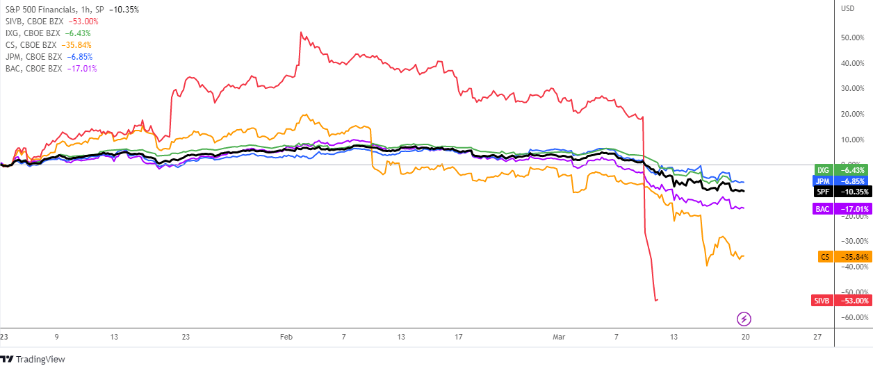
In the comparative chart above there is a year-to-date dynamics of S&P 500 Financials index (SPF, black), the iShares Global Financials ETF (IXG, green), SVB Financial Group (SIVB, red), Credit Suisse (CS, orange), JPMorgan Chase (JPM, blue) and Bank of America (BAC, purple).
On the chart, all of the lines indicate negative performance, with each one below the zero mark. Indeed, SVB and CS are the ultimate losers, while BAC is also suffering a significant loss at -17.01%. Meanwhile, IXG, JPM, and SPF fared slightly better, with losses of -6.43%, -6.85%, and -10.35%, respectively.
This indicates that banking stocks around the world are losing ground following the trigger from SVB, as seen with the decline in IXG and the top two banks in the US.
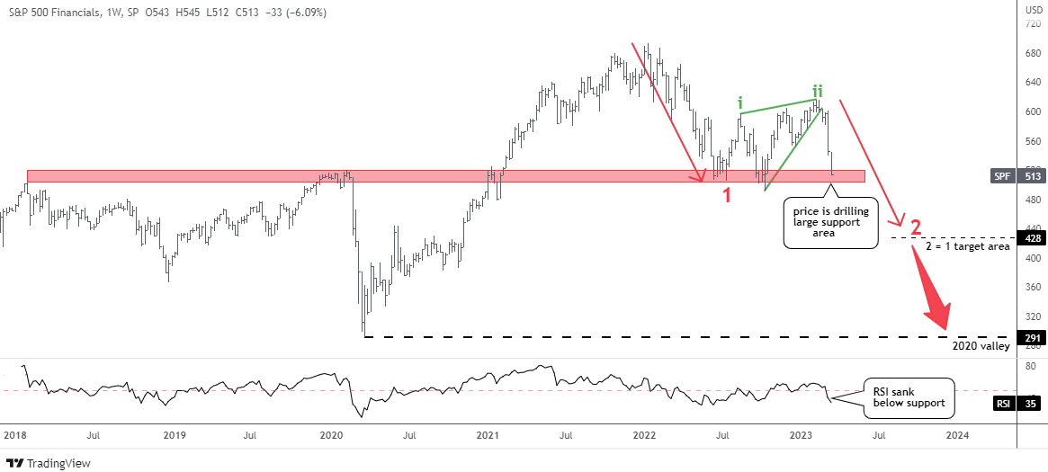
The chart for the S&P 500 Financials index (SPF) indicates the possibility of continued weakness. It exhibits a classic pattern, with two large red moves downwards connected by a consolidation area in green. This consolidation area includes two upward moves (green i and ii), which form a Rising Wedge pattern in green.
The price target for the second red leg downwards is set at $428 (leg 2 = leg 1), which is a drop of almost 17% or $85 from the current level. With a year-to-date loss of 10%, this further decline would add to the pain.
The price has already covered over 50% of the second drop by reaching the significant support area created by the high points in 2018 and 2020, as well as the low point in 2022.
The RSI has already dropped below the support level of 50, indicating a shift towards a bearish trend.
Once the price breaks below the support area formed by the peaks of 2018 and 2020 and the valley of 2022, there are no other significant supports until it reaches the valley of 2020 at $291. This collapse could happen quite rapidly, as seen in 2020, and would result in a loss of over 43% from the current level.
The financial sector makes up 12% of the broad S&P 500 index. Therefore, the descent of the former for 17-43% would likely have a negative impact on the overall stock market.
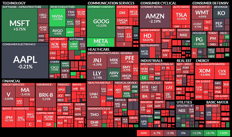
The positive momentum in the technology sector, which accounts for 27% of the S&P 500, helps to mitigate the negative impact of the financial sector’s decline and prevent a significant collapse in the broad index. We can see green spots in the sea of red though in the map of 1-month performance above.
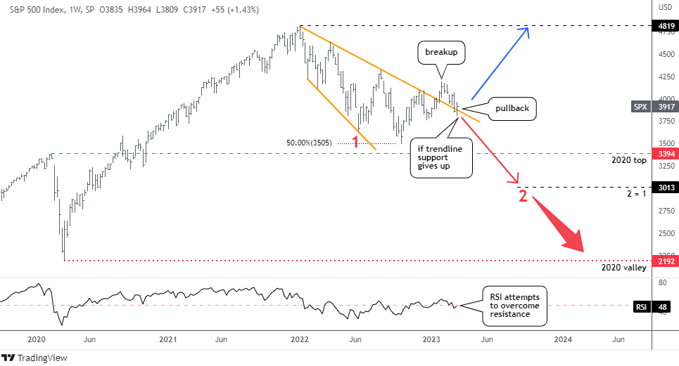
Compared to the financial sector’s graph, the chart of the broad index looks much better. In January, the price broke out of a large correction (indicated by orange trendlines).
Currently, there is a textbook pullback in progress as the price retests the former orange trendline resistance, which has now become a support. The collapse of SVB caused the index to briefly puncture the trendline, but it was quickly pushed back up by technology stocks.
For continued growth, the RSI needs to overcome the resistance at the 50 level. According to a conservative approach, the price should retest the all-time high at $4,819.
If the trendline support is broken and the RSI fails to break into the bullish area, the red-colored scenario could become a reality. This would follow a similar structure as the SPF chart with two legs down in red. The main downside target for the broad index would be located at $3,013, which is equal to the first leg down.
In the worst-case scenario, a crash similar to that of 2020 could bring the price down to the valley of $2,192.
Intelligent trades!
Aibek Burabayev
INO.com Contributor
Disclosure: This contributor has no positions in any stocks mentioned in this article. This article is the opinion of the contributor themselves. The above is a matter of opinion provided for general information purposes only and is not intended as investment advice. This contributor is not receiving compensation (other than from INO.com) for their opinion.
